When Numbers Speak Through Design
When Numbers Speak Through Design
The way data is interpreted and delivered plays an important role in many industries, from public health responses to business strategies in this data-rich world. This is where data visualization becomes essential because numbers alone often fail to tell a story without the right context or presentation, no matter how insightful they are. It serves as a bridge between collected raw data and human understanding and greatly helps people see patterns, identify trends, and make informed decisions. Correct interpretation and analysis eventually lead the spreadsheet as a story and statistics as an action.
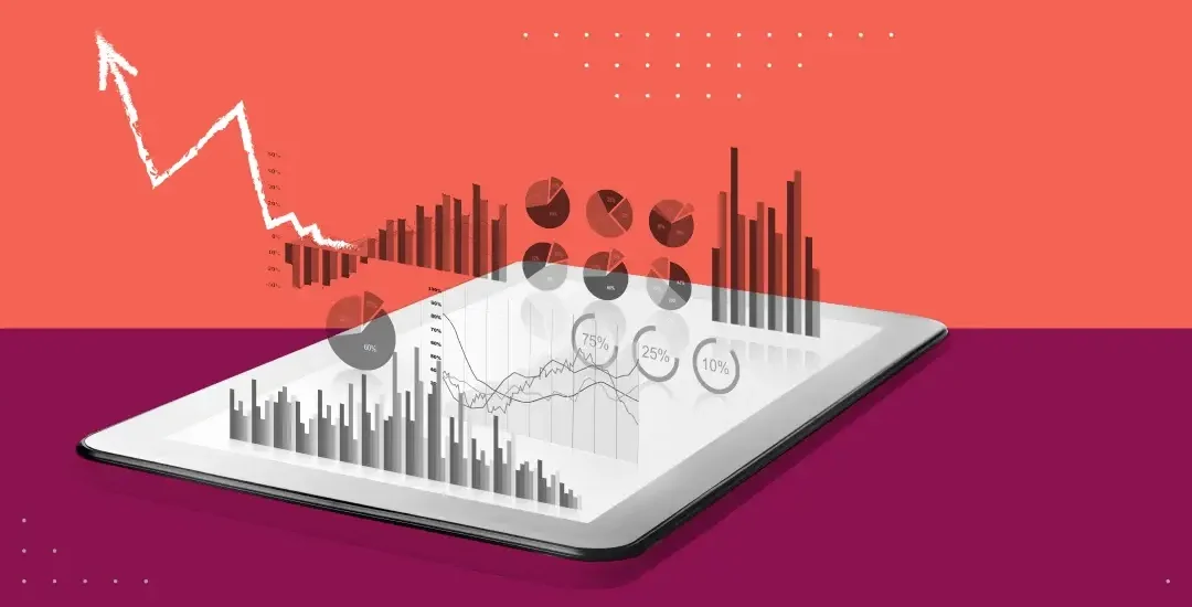
What is important here is that visualization is not just about design but about communication. The way data is presented, such as scientists trying to deliver research results, business analysts reporting quarterly indicators, and journalists explaining election results, has a great influence on how data is understood. Good visualization highlights important patterns and guides viewers' attention to what matters most. It reduces cognitive load, making it easier to process large amounts of information quickly.
Conversely, poor or misleading visualizations can distort understanding and manipulate perceptions. For example, graphs with different widths of the x and y axes can exaggerate or reduce differences, and complex pie charts can obscure more than is revealed. This manipulation occurs frequently during political campaigns, where data are intentionally misrepresented, especially to support biased narratives. When viewers lack visual literacy, which refers to the ability to critically interpret visual data, they become more vulnerable to such distortions.
Many industries that recognize the importance of data visualization are investing heavily in visualization tools and technologies. Platforms such as Tableau and Power BI allow users to create interactive dashboards for real-time decision-making. In the technology and data science communities, it is often used to build customized visualizations using open-source libraries (used for Python programming) such as Matplotlib, Seaborn, and Plotly. These tools support everything from simple bar charts to advanced heatmaps and network diagrams, allowing the visual form to be conveniently adjusted to suit the needs of viewers.
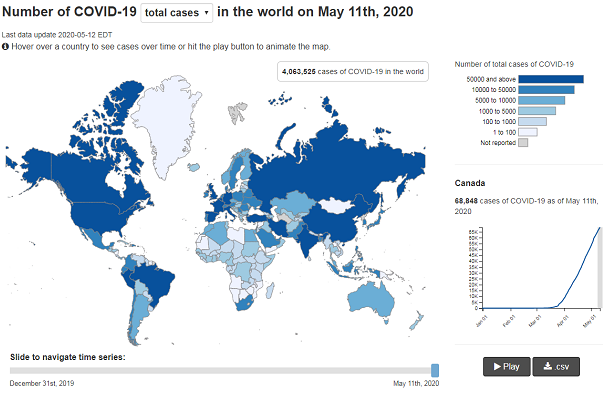
As mentioned earlier, one of the most inspiring examples of data visualization as a public service is from The New York Times, where the COVID-19 tracking dashboard has become a global reference point. Using clean and interactive maps and time-based charts, we have made complex national and regional trends accessible and reliable. Another strong example is Gapminder, a data visualization platform created by Hans Rosling, which uses animated bubble charts to show global development trends such as life expectancy and income over time.
Many industries that recognize the importance of data visualization are investing heavily in visualization tools and technologies. Platforms such as Tableau and Power BI allow users to create interactive dashboards for real-time decision-making. In the technology and data science communities, it is often used to build customized visualizations using open-source libraries (used for Python programming) such as Matplotlib, Seaborn, and Plotly. These tools support everything from simple bar charts to advanced heatmaps and network diagrams, allowing the visual form to be conveniently adjusted to suit the needs of viewers.
As mentioned earlier, one of the most inspiring examples of data visualization as a public service is from The New York Times, where the COVID-19 tracking dashboard has become a global reference point. Using clean and interactive maps and time-based charts, we have made complex national and regional trends accessible and reliable. Another strong example is Gapminder, a data visualization platform created by Hans Rosling, which uses animated bubble charts to show global development trends such as life expectancy and income over time.
Personally, I believe that the power of data visualization is most evident in terms of public discourse and transparency. In an era of rapid spread of misinformation, it becomes more important to present data clearly and honestly. When people can understand the numbers behind claims such as climate change, economic growth, and social inequality, they can engage in meaningful conversations and make responsible choices. After all, the data that is properly visualized democratizes the data and its correct interpretation. Data and its visualization are no longer limited to data experts, but more people can now participate in the discussion.
The demand for skilled, ethical, and effective visualization will only increase as the amount and complexity of data continue to grow. Since holding data is no longer enough, it is necessary to deliver data effectively and correctly.
What kind of data visualization is shaping your mindset lately? Have you ever questioned how charts or graphs are designed? Or have you ever been tricked by purposely distorted data visualization?
Sources:
Cairo, A. (2016). The Truthful Art: Data, Charts, and Maps for Communication. New Riders.
Few, S. (2009). Now You See It: Simple Visualization Techniques for Quantitative Analysis. Analytics Press.
Rosling, H., Rosling, O., & Rönnlund, A. R. (2018). Factfulness: Ten Reasons We're Wrong About the World—and Why Things Are Better Than You Think. Flatiron Books.
The New York Times. (2020). Coronavirus in the U.S.: Latest Map and Case Count. Retrieved from nytimes.com
Gapminder. (n.d.). Retrieved from www.gapminder.org


Comments
Post a Comment